I don't have all that much news to bring to you all today so I thought I'd take a look at another chart. Below is graph of Interest rates vs the PE Ratios (Price to earning ratios of the S & P 500) over the last 120 years in the United States:
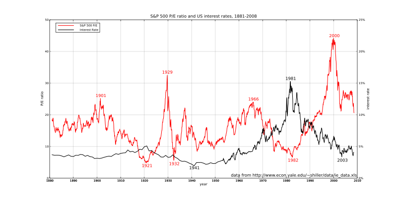
Like I said before I love looking at graphs and charts because they can tell you more than an entire 10 page essay could in just a few seconds. As you can see, we are currently at a pretty high average PE ratio, but having said this, it is so much lower then it was just a few years ago. You also must account for the fact that there is now optimism in growth, so a higher than average PE ratio is not all that bad. The current graph, however, leads me to believe that we may see a leveling off of the Dow at around 9000-9200, where it may stay and hover around for some time until better earning reports come out.
For those of you not familiar with PE ratios, it basically is the return a stock has over a year. If you have a PE ratio of 20, that means it will take the company 20 years to make a profit equal to it's current share price. Divide 100 by the PE ratio and you will get the rate of return the company is making. For instance 100/20 = 5, which means investing in the stock will provide a 5% annual return. Looking at the chart above you can see that in 1982, PE ratios were low, while interest rates were high. Is is because people could make a ton of interest just buying bonds, so why invest into stocks that have a yield lower then bonds do, at greater risk.
It should be interesting to see, how inflation could hamper the recovery of the US stock market should it go up by more then a few basis points.

No comments:
Post a Comment